概览
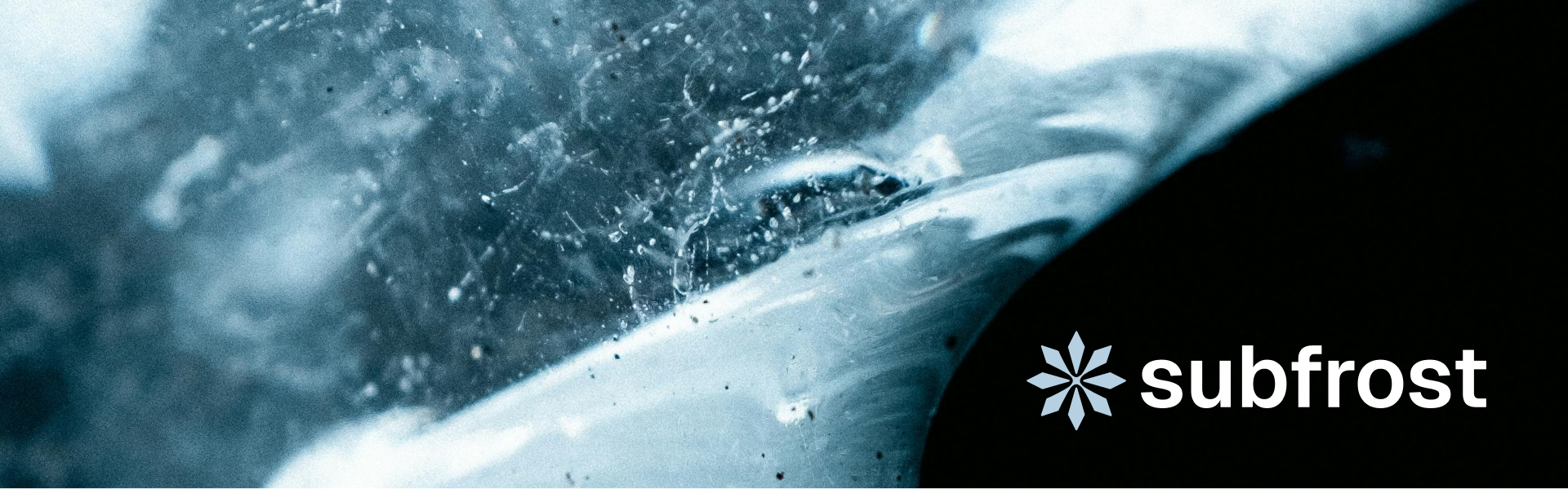
字标
字标是主要品牌资产。白色界面使用黑色版本,黑色或深色界面使用浅色字标。雪花在不同主题中都保持 Glacial 蓝。不要拉伸、描边、重新上色或添加特效。


标志
符号
雪花图标用于紧凑场景:favicon、头像、社交图标与小型导航。彩色版本应使用 Glacial。

图标
色彩系统
品牌色板由四个基础色组成。色阶应通过有纪律的明度步进生成,而不是发明新的色相。
Carbon
Text, dark surfaces, high-contrast UI
#212121
Frost
Soft surface, light background, quiet panels
#E9F0F7
Glacial
Snowflake mark, cooling accents, image tint
#A7C6DC
Flare
Rare alert or emphasis only
#EC4521
色彩
字体
Geist 是主要界面与编辑字体。Geist Mono 只用于代码、地址、指标与技术数据。
Geist
Aa
Quiet, neutral, legible interface typography for editorial pages and product surfaces.
Geist Mono
0123
Reserved for code, balances, technical identifiers, addresses, and protocol data.
字体
图像
视觉素材应体现冰冻、清晰、流动和空间感。使用真实质感与克制表达。避免加密霓虹、光球、散景和装饰性渐变。

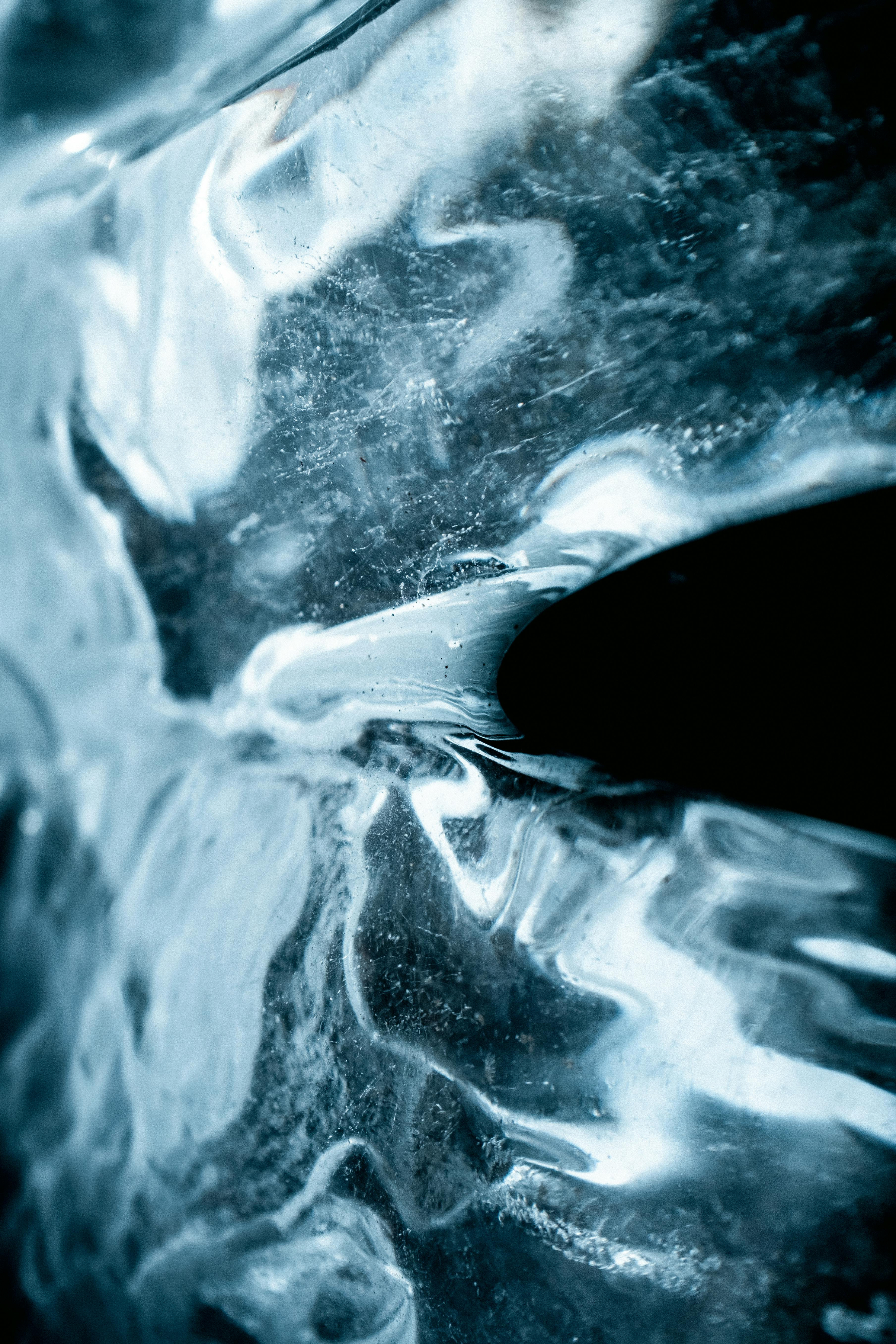
图像
使用规则
使用批准的字标与图标、Geist 字体和 Subfrost 色彩系统。版式保持安静、以图像为核心、足够精确。留白也是品牌的一部分。
Use approved SVG assets
Keep logotype proportions unchanged.
Respect clear space
Do not crowd the snowflake or wordmark.
Keep corners small
Use 6px media radii, never bubbly cards.
Use real frost texture
Prefer product-like ice imagery over generic graphics.
Avoid new hues
Extend the palette through lightness steps only.
Avoid effects
No glow, shadow logos, outlines, or decorative gradients.
